
Hey friends! There's a new Time Out challenge and it's our Home Sweet Home challenge.

This is the photo from a room we want you to use to get your inspiration. Love the beachy and cool tones of this room!

I chose to use the colors as my inspiration. We are sponsored by Stamplorations for this challenge, and I'm using a set called Trendy Spring Blooms. I stamped the flower first in a tan color ink and over stamped it in navy. I fussy cut out the flower. Then I chose this navy pattern paper to go with it. The sentiment was stamped in navy onto kraft cardstock and matted it with navy cardstock. I spritzed it with shimmer spray and added sequins.

Now I can be a little scatter brained when crafting at times! I was focused on using the stamps, and not focused on the inspiration photo! So this was my first attempt. Same layout, just different colors that didn't match the photo colors. I needed another thank you card, so now I have one!

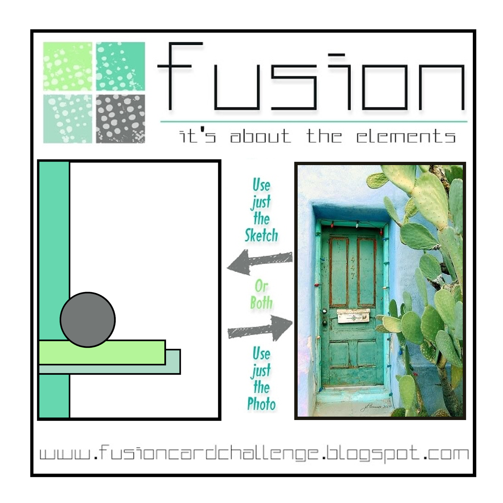
I used the Fusion layout for my cards. You can see where my colors for the second card came from!
You can see more from the Time Out design team and our guest for this challenge, Heather, on the Time Out blog.
Thanks for stopping by!
Recipe
Stamps: Trendy Spring Blooms (Stamplorations)
Paper: Recollections white, kraft, navy, Boxer dp (Basic Grey)
Ink: Sand Dunes (Altenew), night of navy (SU)
Accessories: Stitched rectangle die (MFT), sequins, shimmer spritz

4 comments:
I love how you stamped this on tan and then over stamped-lovely look and also how you used the double layer for the sentiment. How funny you made the other card too! Also think though this would have worked with the colours....still you have 2 cards now!!
Know just how that feels, Lisa! They're both fabulous ... the navy and kraft is elegant and stylish ... and the soft blues and greens are pretty and whimsical! Hugs, Anita :)
Both of these cards are fantastic. It's interesting to see that just by swapping out the colors, you can achieve such a different look.
Both cards are great. I too, love to see the magic when the same design is done in different colors and patterns. Wonderful take on the photo.
Post a Comment