
I decided to use the current Color Throwdown colors. Great combo and it really helped get the creative juices flowing for me today!
 Our Artful INKables DT memeber, Jen Pahoulis, did this tile tutorial on the AI blog recently, and I decided to use it. I had done this once before and really liked the outcome. It's nice to come back to a technique you haven't done in a while. Here's what I came up with.
 I used an AI set called Fairy Whimsey. There is a fairy in the set, but I chose to use the flower and the butterflies. I have to confess that I accidentally grabbed Bravo Burgundy paper and matched my copics to it to color the flower and butterflies. I realized my error and had to restamp and color the flower. I just colored over the butterflies because the parts were so small. I tried that with the flower, but just got a dark, muddy color! It just never goes smoothly!
To get the tiles, I just loosely measured the flower and butterfly stamps and then cut my 5" x 3 3/4" piece of white card stock accordingly to fit those two stamps. Then I cut the remaining pieces randomly. Each piece was sponged with Baja Breeze to get the "grout" look. I secured them to the eggplant piece and then onto my celery base. I used the Martha Stewart butterfly trio punch to get the butterflies...one in each color. There are green crystals adhered to the middle of each one. I bent them to get some dimension. I also added stardust stickles to the butterflies and the flower for some sparkle.
I hope you enjoyed today's post. I really appreciate your comments! Please join me on Tuesday when I'll be participating in the Paper Makeup Stamps Birthday Bash blog hop. PMS turns 2 on February 2, and there will be some partying going on. See the announcement on the top left side of my blog. Click on it and it will take you to the PMS forum, which is where the party will be happening Tuesday night! See you then!
Recipe
Stamps: Fairy Whimsey (AI)
Paper: PTI white, certainly celery, elegant eggplant, baja breeze
Ink: Memento tuxedo black, baja breeze
Copic Markers: BV08, 17; B52, 95; YG03; G40; W-3
Accessories: MS butterfly trio punch, crystals, stardust stickles, sponge dauber

 There is a


 We are being sponsored today by Lauren Meader from
  The stamp set is called
 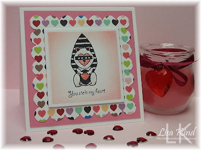 The template is appropriately called
  The digi paper is called
  Want to see more? Stop by the
  This week's Think Ink Tuesday challenge is to THINK SPRING!! To me that means light and pretty colors.
 I haven't used this set called
  I'm going to use Katie's words to share a story with you about a sweet young girl, Baylee, for whom this image was created:
 We all had lots of fun with these colors and we hope you will too. It's perfect for this time of the year with Valentine's Day right around the corner or for a birthday card, which is what I made.
  I used SU's stamp from Thoughts and Prayers. It's been a long time since I've used my SU stamps! I've always loved this stamp, and I've seen it colored in so many different colors, beautiful each time. It's colored with blush, gray, and burgundy SU markers, stamped on a piece of very vanilla, and then I cut and embossed it with a nestie. While still in the nestie, I swirled some basic gray ink around the perimeter of the image. I love that technique...you don't have to use a mat. The sentiment is from a set just released on Thursday from
 I love the detail on this pretty charm! I just put a jump ring on it and attached it to the ribbon with embroidery floss.


 Isn't this a lovely quote? I think it would be perfect for Valentine's Day, anniversaries, new baby, etc. Very versatile, indeed! I used yesterday's SCS sketch for this card and acted upon my New Year's resolution to use up some of my dp. This is a very old SU dp called Recollections...it's not even double-sided and the paper is very thin! They've come a long way! I paired it with cranberry crisp and mellow moss. I swirled cranberry crisp ink around the edge of the sentiment while it was still in the nestie die. I also used some sahara sand to tone it down a bit. I saw this trick used by my friend,
 Is this a cute fairy, or what? I just LOVE these fairies! And I love tea! The sentiment (isn't it great, too?) is from


 If you don't know what faux stitching is, you can get instructions on SCS with
  I've had this jeans pocket stamp (yes that's a stamp, not real jeans!) from my LSS one day while I was standing in line. It just called to me to pick it up...and I did and this is the first time I'm using it! The stamp is from Judi Kins and I inked it with Faded Jeans Distress Ink from Ranger/Tim Holtz. It really is the color of faded jeans...amazing! When I took my sewing machine out of the box, it was already threaded with yellow thread. Perfect, since jeans usually have yellow stitching. So I went to work following the stitch lines on the pocket. Here's a closeup of it.
  I really like the way it came out...it looks so real! The dp is Basic Grey's Bittersweet, and I paired it with Regal Rose. I sewed the dp to the cardstock with one of the three zig-zag stitches on the machine.
  I ran the white mat through the Swiss Dots cuttlebug folder. The sentiment is from
  So what do you think? Can you work with this one? Here's what I came up with.
 Since Valentine's Day is right around the corner, I decided to do a Valentine's themed card. I love the PMS Beautiful Day Fairies (it's what drew me to the company), so I used the
  Let me explain what I was thinking when I made this. When I thought of "What's Moo?", I thought of keeping someone far away up-to-date. What better way to do that than with pictures? Well, it seems no one sends "real" pictures these days, they are always digital. So I made a CD cover with this My Timeless Template called
  There is a new challenge going on at the
  I did my card last night after I found out PMS was hosting this challenge, so I did something quick and easy using the PMS stamps set
  I also used the current