Saturday, June 23, 2012

Just Us Girls #142 - Inspiration Photo Challenge

Happy Summer!  Today begins Day 1 of my summer!  I wrapped up my classroom yesterday for the summer and didn't have to get up at 5:00 am this morning!  Although I have a busy day today.  My niece Maria is graduation from high school today and her party is today as well.  We are so proud of her!  She wants to be a doctor and I hope she can endure the grueling studies ahead of her.  But she is a very determined young lady, so I don't doubt for a minute she'll achieve her goal. 

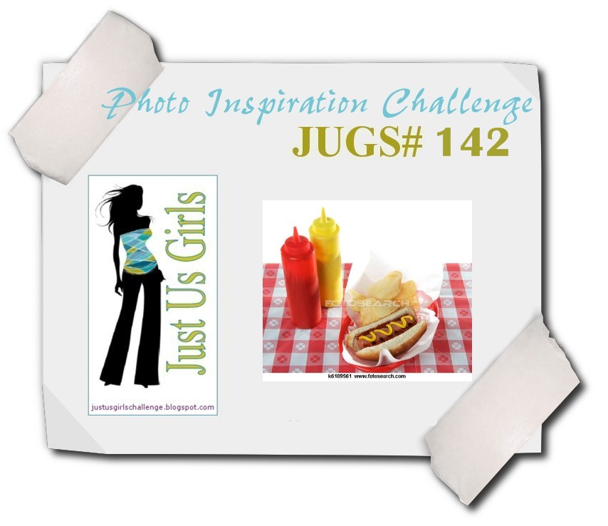
But I digress.  Today begins our 142nd Just Us Girls challengeVicki has generously taken on the new inspiration photo challenges and she's come up with a great photo today.  Great for the beginning of summer...a picnic with hot dogs and chips!  Yumm-o!
 I went pretty literal with the photo.   I knew I wanted to use PTI's Vintage Picnic and Vintage Picnic Sentiments stamp sets for this card.  I used the die to cut the picnic basket out of white cardstock, then colored it with copic markers.  I stamped the flowers on a Spellbinder's die and colored that with copics as well.  I also used some Antique Linen ink to distress it.  The red checked paper is from Rosy paper pack by My Mind's Eye and the stripe from Basic Grey's PB&J.  I used a SU punch and Riding Hood Red paper for the border.  The ribbon is SU's Crushed Curry dotted ribbon.  The flowers are Prima and I added a silver and crystal flower in the center.  The banner is a die from WPlus9 Design Studio that seems to be getting lots of use lately!  I did add some Star Dust Stickles to the centers of the flowers in the basket that is hard to see, but it just adds some sparkle.

 The sketch is this one from Card Patterns.    Loved it!  I'm also entering it into the Moxie Fab World gingham challenge.

We have some great inspiration for you from the JUGs design team.  We also are bidding a fond farewell to our much loved Dana Gustafson.  She will be sorely missed, but life is getting busy with her family and it was time for her to move on.  We wish her well!  But you can still see the rest of what the team did at these blogs.

Thanks for stopping by today!  I'm hoping to get some more stamping and posting in now that I'm on vacation!  I need to start playing for fun!  See you soon!

Photobucket

Thursday, June 14, 2012

Maria Levine's Got {ippity}? Summer Themed Blog Hop

Maria Levine's Got {ippity}? design team is hopping in their monthly blog hop.  This month is a summer themed hop.  If you came here from Vicki's blog, you are on the right track.  I'm the last on the hop, so make sure you start at Maria's blog and hop along.

I'm using this set called Pain and Strength.  I decided I liked the tree in black and white, and decided to make a black and white card.  But I wasn't thinking about the "summer theme" here as I was makind it.  But as I look at it, it does have flowers on the tree, flowers on the dp, and silk flowers, so I think it can be called summer themed.  The dp is from DCWV called All Dressed Up.

This is the great sketch I used from Sweet Sunday sketch.

Here is some important information regarding our hop.  If you leave a comment on all the DTs blogs, you will have a random chance to win an {ippity} prize from Maria.  We are looking for our July guest designer.  All you have to do is upload your card to our Facebook page here to enter.  If you see anything you like and want to order, you have to do it through an Ippity girls.  Go to this post and choose Maria Levine as your {ippity} chick!

Here is the hop lineup in case you get lost.
Becky Litz, June Guest Designer
Lisa Kind (you are here)

Thanks for stopping by and hopping with us!
Photobucket

Pretty Palette #64

We changed things up a bit over at the Pretty Palette challenge.  Our challenges have changed to every other week and we changed our posting date to Thursdays.  You will have two weeks to play.  On the opposite Thursdays, you can participate in the Pretty Pattens challenge which will also run for two weeks.

 This is what I came up with for this week's color challenge.  I used the Seas the Day digital stamp set and colored it in GIMP.  I shaded some bashful blue ink around the image while it was still in the die.  A little darker on the bottom to mimic the water and lighter on top for the sky.  I also distressed it a bit with some tea dye distress ink.  The sentiment is from the So Sentimental acrylic stamp set.  The paper was the perfect fit for these colors.  It's from My Mind's Eye called Blink of an Eye.  I used the flag die from WPlus9 and an SU scallop border punch for the side.

This is the sketch I used from Card Positioning Systems.

You can see more from the design team on these blogs.
 
Thanks for stopping by!

Photobucket

Saturday, June 9, 2012

Just Us Girls #140 - Technique Challenge

Hi friends!  This is technique week here at Just Us Girls, and our fabby Maria chose this great technique called Acrylic Distress.  She found the tutorial here on SCS.

 I used the technique on the circle in the middle of the card.  I used soft suede for the card stock and the acrylic paint I used (the only one I had!) is Pearl.  I thought I had many bottle of the Ranger paint dabbers, but apparently they are all distress inks!  So Pearl it was.  It looks like tin to me on this paper.  I first ran the circle through the embossing folder, then painted on the Pearl paint and dried it with a heat gun.  I sanded it with a Tim Holtz sander.  I didn't have to do the next step in the tutorial, which was to apply a distress ink over the sanded parts to make it look more distressed because my paper color did that for me.  Then I just put the card together.  The paper is SU's Everyday Enchantment, the dies are Simply Jane and Beautiful Blooms from PTI, the brad is SU too, and the cardstock is soft suede and poppy parade.  The sentiment was created using a Spellbinder's die and the sentiment is from PTI's Blooming Button Bits.

This is the sketch I used.  I generally don't care for middle panels turned on an angle, but I saw some cards made with this sketch and I kind of liked it!

 The JUGs design team has some great inspiration for you.  Please stop by these blogs to see for yourself!

Thanks for stopping in today!  Have a great weekend!
Photobucket

Monday, June 4, 2012

My Time Made Easy - A Year in Review

Hi friends!  Today the My Time Made Easy design team is posting our montly Year in Review projects.  This is where we use old and new products.  I'm using three cut files (one new, two old) with new and old paper and old stamp sets.  Let's begin.

Last month I created this template called Blue Collar for my father-in-law for Father's Day.  I put some cotton handkerchiefs in them.  You can see the post here.  I always give him gift cards to his favorite restaurants around town, so I decided to make this gift card holder called Wallet of Wishes to go along with it.

I started by recoloring this woodgrain paper from the new Camp Out digital paper pack in gray.   Then I created the label using A Vintage Day for Day digital stamp set in marigold.  I added a button on the tab and threaded it with some marigold baker's twine.

Here's the inside where you put the gift card.  He's not getting this Target card...I just haven't gotten him his restaurant gift cards yet.  This one is mine!  You can see how there is a slot for the card to sit in.

There's another pocket behind the gift card slot, so I created a tag using the same images from the front label.  You can write your message on this label.  This wallet can be used in so many ways.  I can't wait to make it for a girly girl!  Maybe a Coach or Chanel wallet!

I decided to use another cut file for a little gift for a friend.  This is a new cut file called Paper Bag.  These are so easy to cut and assemble and would be terrific shower favors or just a little something to give as a hostess gift.  I put two small bottles of lotion from Bath and Body Works inside and they fit perfectly.  I used the Darling Dots digital paper for the bag. It's printed on white cardstock, then cut out.  The label is another cut file called All Tied Up Rectangles.  I stamped the sentiment from the Sign It acrylic stamp set.  The frilly details on the label is a stamp from Killer Curves Fancy Frames.

I tied the label on with some white satin ribbon and tied a pretty bow in the side.   So pretty!

That's it for me, but the entire MTME team is posting today, so make sure you stop by their blogs!
Thanks for stopping in today!  Have a great week!

 
Photobucket

Sunday, June 3, 2012

My Time Made Easy Post Release Day and Pretty Palette #63

Hi there!  We are in our post release days here at My Time Made Easy.  Have you seen the new products that were released Friday?  You can see the new products here.  Today begins our new Pretty Palette challenge too, so I combined the new products with this challenge.  How do you combine these feminine colors with camping themed products?  Make happy camper girls cards!

 Wouldn't these be cute to send to your girlfriends for a girl's night?  I started with the sentiment from the new Let's Go Camping digital stamp set.  This sentiment has a tent image attached to it, but since it's digital, I was able to crop out the tent image.  I then colored the letters in the challenge colors in GIMP.   Then I printed it out four times on some white cardstock and cut them into fourths for the base of my card.  I colored the Darling Dots digital paper in the challenge colors as well and mounted it below the sentiment.  I added pink and gray ribbons for that feminine touch.  Then I cut out the tents using the new Camping Gear cut file in pink and gray.  I backed it with another tent enlarged to 115% and cut out of white cardstock.  I added some pearls on the tents for a more feminine feel.

 Here are all of them together.  So sweet don't you think?
Here are some blogs from both the MTME and Pretty Palette design teams that you'll want to see.

MTME Design Team

Pretty Palette Design Team
I hope you enjoy the inspiration!  Thanks for stopping by!
Photobucket

Saturday, June 2, 2012

Just Us Girls #139 - Sketch Challenge

Hello my crafty friends!  This week is sketch week at Just Us Girls.  I love me a good sketch, and our very talented and sweet Andrea has a great one that can be a CAS sketch or you can add on more embellishments to make it more.


 I went more on the CAS side with my card.  I had some pretty flowers out, but I needed to make something flat so I could send it in the mail.  This one is actually going in the mail!  How many cards do you make and not send?  I have tons!  I started with this pretty double-sided paper from Authentique and paired it with gray cardstock.  I rounded opposite corners of the panels.  The sentiment is and oldie but a goodie from SU called Sincere Salutations.  I stamped it in gray SU ink.  The ribbon is something from my stash that matched perfectly.  I added some silver beads to bling it up a bit.

You should stop by the following blogs to see what the rest of the JUGs design team created.  We also have a new featured designer for the month of June, so please stop by her blog as well.

Hannelie Bester, June Featured Designer

Thanks for stopping by!  Have a great weekend!
Photobucket

LinkWithin

Blog Widget by LinkWithin